
Although people spend a lot of time online, they expect their time to be well used…and fast results. If a website is difficult to interact with, a potential client is apt to move on to another website. We want our site visitors to click and stay…and come back again…to our websites. Here are the best ways to ensure our website is reaching its fullest customer potential:
People expect websites to be organized, well labeled, and easy to navigate.
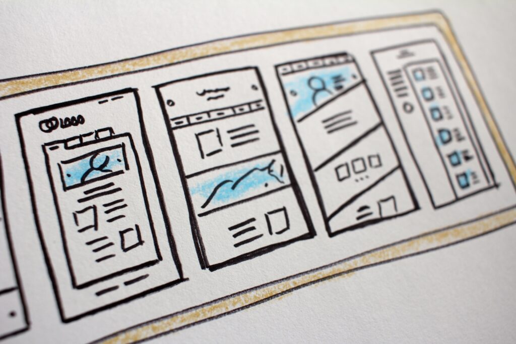
Nothing is worse than finding a website and looking, looking, looking for what you need. Sometimes the text gets lost in catchy graphics, the links are in an odd place, or the information you need is hidden due to a design choice. Life is frustrating enough, so we need our website to be streamlined and clear for the user, not a scavenger hunt for a time sensitive issue.
Some ways to avoid this are:
- keep the menu in a typical place, such as the top or side
- make sure the text on the menu is bold and legible
- have others test the website out and get feedback about making it easier to navigate.
People expect to see contact information and social media links.
Again, don’t make the potential client have to search for how to get in touch with you. Your contact information (business name, address, phone number, email, social media links) should be current, visible, and easy to find.
People expect to find relevant, up to date content and links.
Once someone clicks onto your website, the way to keep them there is with relevant and current content. If the last posted information is from a year ago, the risk of losing them is high. The same goes for any links on your site–you should regularly check that the links still work and are up to date–because customers love to see information they need now.
Taking the time to regularly update your site and add current photos and information, testimonials, visuals, and graphics can get and keep a new client, sending a clear message that YOU have what they need.
People want the website to have a consistent aesthetic and be brand representative.
Your website should clearly represent your brand, and the best way to do that is with a consistent and appropriate aesthetic. What is your brand? What does it look like? What is the overall feeling your client should get with your website? What visuals, colors, and fonts best represent your message?
When they see your site, they are really seeing you, so spending some time on the identity you want to cultivate with your business can help shape the aesthetic you go for.

Some questions to get you brainstorming your website design are:
- Should your color scheme be bold or calming?
- Are your images promoting all aspects of your brand?
- Are your images strategically placed for maximum effect?
- Are the elements of your site visually balanced?
- Is the font visible and the right look for your brand?
Another key thought: sometimes less is more. Since every part of the website should hold visual impact, resist the urge to overwhelm the viewer with too much to take in.
To keep them coming back, people like to see a blog.

Although people can simply go to a site on occasion when they need certain information, to keep them coming back for more, a blog can be just the thing. Regularly posting blogs on topics relevant to your brand and business with the right amount of keyword placement, current research, and personal appeal can keep customers coming back to your site again and again.
The most valuable tool for building the best site is feedback from users…by assessing what your customer needs and making sure your site is user friendly, your website’s ability to stop a searcher in their tracks will sky rocket. Building a site that reflects your brand and engages the viewer adds traction and exposure that can boost your business. For these and more small business needs, Em and a Pen can guide you through and provide professional feedback to create the perfect website for your brand.